Anchorage RunFest Logo Design by Kimografix

Web Design

About Anchorage RunFest

Anchorage RunFest is a premier annual event organized by the Anchorage Running Club, dedicated to promoting an active and healthy lifestyle within the community. With its scenic routes, diverse race categories, and participation from both local and international runners, Anchorage RunFest has become a highly anticipated event for racing enthusiasts of all levels.

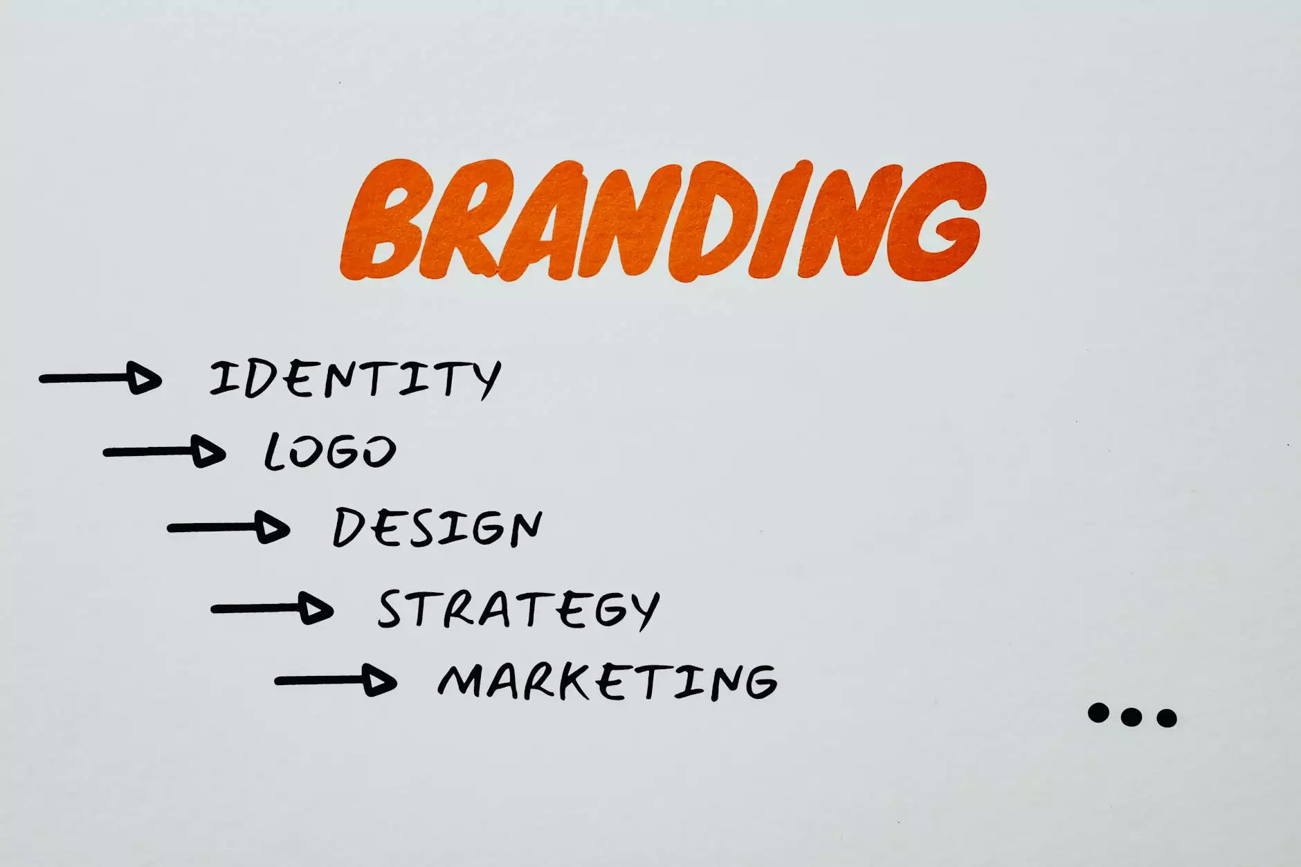
Importance of a Captivating Logo

A captivating logo is crucial for Anchorage RunFest to create a distinct brand identity and leave a lasting impression. Your logo should represent the spirit of the event, capture the beauty of Anchorage, and convey the excitement of participating in the races.

Kimografix: Your Design Partner

Kimografix, a reputable visual arts and design studio specializing in creating unique and eye-catching logos, is here to bring your vision to life. With our expertise in graphic design and deep understanding of the arts and entertainment industry, we have the skills to craft a logo that perfectly aligns with the essence of Anchorage RunFest.

Why Choose Kimografix for Your Anchorage RunFest Logo?

  • Exceptional Creativity: Our team of highly skilled designers possesses an exceptional level of creativity and understands the importance of visual storytelling. We will design a logo that captures the essence of Anchorage RunFest and resonates with your target audience.
  • Experience in the Running Community: With a deep understanding of the running community, we know what appeals to runners and race enthusiasts. We will create a logo that reflects the passion and energy of the event, igniting excitement in participants and spectators alike.
  • Customized Approach: We believe in tailoring our designs to meet your specific requirements. Our designers will work closely with you to understand your vision, incorporating your ideas while adding their own touch of creativity and expertise to deliver a logo that exceeds your expectations.
  • Attention to Detail: At Kimografix, we pay meticulous attention to detail to ensure that every element of the logo design contributes to its overall impact. From selecting the right color palette to choosing the perfect typography, we leave no stone unturned in crafting a visually stunning logo for Anchorage RunFest.
  • Timely Delivery: We understand the importance of meeting deadlines, especially when it comes to event promotions. Our team at Kimografix is committed to delivering your Anchorage RunFest logo within the agreed-upon timeframe, ensuring that you have ample time to incorporate it into your marketing materials.

Stand Out with a Captivating Anchorage RunFest Logo

Make Anchorage RunFest truly memorable with a captivating logo designed by Kimografix. Our passion for visual arts, our extensive experience in the design industry, and our commitment to excellence make us the perfect partner for bringing your logo vision to life.

Contact Kimografix Today

Ready to elevate Anchorage RunFest's brand presence with an exceptional logo? Contact Kimografix today and let's embark on a creative journey together. Our team is eager to discuss your requirements, answer any questions you may have, and showcase how our logo design expertise can help you make a lasting impact on participants and spectators.

Comments

Claudio Miro

The logo's dynamic and modern design mirrors the excitement and energy of the RunFest.

John Costa

I can see the dedication and passion that went into creating this logo. It's truly inspiring.

David

The use of negative space in the logo's design adds a layer of sophistication and elegance.

Jacqui Smith

The sharp and contemporary design of the logo is a perfect representation of the dynamic spirit of the RunFest.

Carlos Gallego

The use of negative space in the logo's design adds a layer of sophistication and elegance.

Jolene Eicher

The logo's minimalist and clear design makes it a memorable and powerful visual representation of the event.

Endora Comer-Arldt

The logo's design feels inclusive and welcoming, aligning with the spirit of the RunFest.

Christina Fong

The clean lines and modern look of the logo are very appealing.

Sean Huff

The logo perfectly captures the essence of the RunFest in a bold and dynamic design.

Chris Nichols

The logo embodies the essence of community, health, and vitality. It's more than just a design—it's a statement.

Lucio Avila

The logo's sharp and dynamic design perfectly captures the energetic spirit of the RunFest.

Pablo Medina

The logo's design feels fresh and contemporary. It's a great reflection of the event's forward-thinking approach.

Carin Burr

The logo has an air of excitement and adventure. It really captures the essence of the RunFest.

Susan Rice

The logo's design encapsulates the essence of the event in a visually stunning way. It's a remarkable piece of work.

Vishal Chandra

The logo is so lively and captivating! It's a great visual representation of an exciting event.

Scott McNiven

The logo's design is timeless and versatile, making it a great choice for representing the RunFest.

Rusty Bryant

The use of typography in the logo is so impactful. It adds a strong sense of character and identity.

Chris

The logo's thoughtful composition and attention to detail make it a standout piece of design work.

Ken Santoro

The logo's use of negative space is clever and effective. It's a well-thought-out design.

Louis Irmo

The logo's design is so visually engaging. It provides strong visual impact.

Alan Honkus

The logo's sleek and modern look perfectly mirrors the forward-thinking approach of the Anchorage RunFest.

Shanon Pereira

The logo is a perfect representation of the active and healthy lifestyle the RunFest promotes.

Hillary Pelty

The logo gives a sense of movement and excitement. It's perfect for a running event!

Christine Saltonstall

The balance and harmony in the logo's design create a sense of visual unity and strength.

Kris Merkel

The logo's dynamic design captures the excitement and energy of the RunFest in a compelling way.

Jose Segura

The logo is so dynamic, it makes me want to participate in the RunFest!

Lindsey Worster

The logo's bold and clear design is a testament to the creativity and skill of Kimografix.

Rui Tian

The use of symbolism in the logo is powerful. It speaks volumes about the event.

Karen Griffin

The logo's design effectively communicates the active and healthy lifestyle promoted at the RunFest.

Matt Epstein

The logo's bold and spirited aesthetic perfectly captures the spirit of the Anchorage RunFest.

Fred Schonenberg

I appreciate the design's attention to detail and thoughtful composition. It's a standout logo.

Hardy

The logo's design effectively communicates the active and healthy lifestyle promoted by the RunFest.

Cecelia Lardieri

The logo's sleek lines and energetic vibe perfectly capture the excitement of the RunFest.

Alisa Prater

The logo's sleek and contemporary look makes it a perfect fit for an event like the Anchorage RunFest.

John McKenna

The simplicity and effectiveness of the logo make it a standout visual representation for the RunFest.

Nakshi Desai

The logo's vibrant and lively colors create an energetic and dynamic visual presence.

Anne Edwards

The logo's use of bold colors and strong lines creates an impactful and memorable design.

Toto Tata

Love the sleek and professional design! It's really appealing.

Robin

The logo's design is so well-crafted and thought-out. It's a testament to great design work.

Manish Shah

The logo's vibrant and captivating design is a true representation of the dynamic spirit of the event.

Naresh H

The logo's minimalist and clear design makes it a memorable and impactful visual representation of the event.

Amanda Blanchard

The logo's bold and vibrant design is an instant attention-grabber. It's hard to look away!

Bibop Gresta

The logo's bold and vibrant colors create an energetic and lively visual impact.

Erica Ruch

The logo's clever use of negative space adds a layer of sophistication and depth to the overall design.

David Sproat

The logo's design is so visually engaging. It really draws the eye and captures attention.

David Ashman

The logo's design distills the essence of the event into a powerful and memorable visual identity.

Brendan

The logo's dynamic and modern design mirrors the excitement and energy of the RunFest.

Vivian Rivera

The logo is a true reflection of the event's values and mission. Well done!

Gordon Severson

The logo's sleek and contemporary look makes it a great fit for an event like the Anchorage RunFest.

Yasiela Gomez

The vibrant colors really make the logo stand out. It's refreshing to see such bold choices.

Hugo Garcia

The logo is an excellent representation of the Anchorage RunFest with its bold and dynamic design.

Cornessa Samuels

The logo's sleek and modern look is a perfect reflection of the Anchorage RunFest's forward-thinking approach.

Mike Faucher

I love how the logo reflects the sense of unity and shared purpose that the RunFest embodies.

Dennis Isherwood

The logo is a great example of effective and impactful branding. It's a visual treat!

Briceida Jaimes

The balance and harmony in the logo's design make it so visually appealing.

Smsm Yahya

The logo is a perfect blend of modern and timeless design elements. It's a winner for sure.

Robin Finnegan

The logo's combination of elements tells a story of movement, progress, and achievement. It's a triumph of design!

Cindy Tran

The logo's design feels agile and dynamic, just like the event itself. It's a perfect match!

Stavros Aktipis

The choice of typography in the logo is excellent. It adds a touch of elegance and sophistication.

Tom Wilson

The logo exudes a positive and invigorating vibe. It sets the perfect tone for the RunFest.

Eric

I'm impressed with the attention to detail in the logo. It's clear that a lot of thought went into it.

Amy Zilla

The logo's sleek and modern look is a great fit for an event like the Anchorage RunFest.

Scott Zigler

The logo is well-balanced, and it gives off a sense of stability and confidence.

Ivan Sims

Great article! I've always been interested in the Anchorage RunFest. Can't wait for the next event!

Peggy Reall

The logo is a visual celebration of movement, vitality, and the spirit of the Anchorage RunFest.

Jose Azcatate

The logo's energetic lines and bold design truly capture the excitement of the RunFest.

Charles Venable

The logo's sleek and modern design makes it a true standout among event logos.

Mark Munns

The logo's design is a masterful distillation of the event's essence into a visually compelling identity.

Space Thinking

The logo's use of negative space adds a layer of depth and sophistication to the overall design.

Puanani Jung

The logo's sharp and vibrant design perfectly captures the dynamic spirit of the RunFest.

Sam Heitner

The logo's fresh and modern aesthetic reflects the forward-thinking approach of the event.

John Hampton

The logo's dynamic design effectively captures the excitement and energy of the RunFest.

Alfreda Thompson

The use of different fonts in the logo is really eye-catching. It adds a nice touch of variety.

David Wager

The logo has a sense of unity and inclusivity, reflecting the diverse community of runners involved.

Add Email

I like how the logo incorporates elements that represent the Alaskan spirit. It's a nice nod to the location.

Gregory Pruett

The logo's use of symbolism effectively communicates the values and mission of the event.

Rita Cruz

The logo's modern and distinctive aesthetic sets it apart as a visually striking representation of the event.

Christian Shubin

The logo's timeless and adaptable design makes it a versatile representation of the RunFest.

Hd McCarty

The logo's simplicity and clarity make it instantly memorable. It's a great piece of design work.

Holly Lane

The logo's use of symbolism effectively communicates the event's values and mission.

Gilbert Mauer

The logo's energy and enthusiasm are contagious. It's a perfect representation of the RunFest's spirit.

Suman Saraf

Kudos to Kimografix for creating a logo that embodies the energy and enthusiasm of the RunFest.

Sean Sullivan

The logo's design feels inclusive and welcoming, which resonates with the RunFest's spirit.

Carmen Gauna

As a designer myself, I can say this logo is top-notch. It's memorable and impactful.

Morgan Fields

The logo feels inclusive and welcoming, which perfectly aligns with the RunFest's values.

Mark Comora

The logo's sleek and modern aesthetic sets the perfect tone for the RunFest. It's so inviting!

Ttt Ttt

The logo's design is a masterful distillation of the event's essence into a visually compelling identity.

Tina Akin

The logo is a visual celebration of movement, vitality, and the spirit of the Anchorage RunFest.

Leslie Lambert

The logo's vibrant and captivating design is a true representation of the vibrant spirit of the event.

Arnis Budrevics

The logo's timeless and adaptable design makes it a versatile representation of the RunFest.

Unknown

The balance and harmony in the logo's design create a sense of visual unity and strength.

Jason Ray

The logo's clean and bold design is a testament to the creativity and vision of Kimografix.

Steven Horsburgh

The logo's modern and distinctive aesthetic sets it apart as a visually striking representation of the event.

Pamela Hepworth

The logo exudes a powerful sense of community and togetherness. It's a strong visual identity for the event.

Hilary Fields

I'm impressed by how the logo manages to convey so much about the event in a simple, clean design.

Brianna Leclerc

The choice of colors in the logo is so uplifting! It really captures the energy of the event.

Brandon Redmon

The logo evokes a feeling of strength and determination. It's a great reflection of the event.

Alice Lowy

The logo perfectly captures the spirit of the event. Well done!

Patrick Jenny

I appreciate the design's simplicity. Sometimes less is more, and this logo proves it.

Joshua Stern

The logo is a celebration of movement and vitality. It really embodies the spirit of the RunFest.

Daneen Kiger

The lively and spirited design of the logo perfectly embodies the energy of the RunFest.

Sean Glass

The logo's thoughtful composition and attention to detail make it a standout piece of design work.

Jacque Lambert

The logo's design embodies the event's ethos of movement, progress, and achievement.

Rinaldo Zambello

The logo's fluid lines and dynamic shapes convey a sense of forward motion. It's very energizing!

Leonard Tshali

The logo's design is versatile and adaptable, making it suitable for various uses. It's a smart choice.

Melissa Cabot

The logo's design immediately conveys the sense of action and vitality that the RunFest represents.

Naomi Seckler

The logo feels modern and fresh. It's a visual representation of a vibrant and dynamic event.

Michael Kelley

The logo's design exudes energy and movement. It really captures the essence of the RunFest.

Joshua Zempel

I love how the logo encapsulates the spirit of the RunFest with such a sense of enthusiasm.

Neha Yevalekar

The typography in the logo is impactful, adding character and identity to the overall design.

Frank Hermsen

The logo's typography is so distinctive and dynamic. It really adds a punch to the overall design.

Victor Moreau

The logo's modern and dynamic aesthetic echoes the excitement of the RunFest.

Barry Driscoll

The logo's design tells a story of passion, camaraderie, and determination. It's truly inspiring.

Paulo Majovski

The logo's design is a perfect embodiment of movement, progress, and a sense of achievement.